Customize your product page
The product detail page is critical for driving conversions. It presents product information, purchase options, and related recommendations. This guide helps you understand the page structure, editing steps, and customization options.
Step 1: Select a page
In the editor’s top navigation bar, click the dropdown next to Home page to expand the list of supported page types for the current market.
- Select Product → Default product to access the default product detail theme.
- You can also click Create theme to design a new custom product page theme.
Step 2: Choose a specific product for preview
- Once a theme is selected, the system will automatically load and display a preview.
- To see how it looks with actual content, click Edit under the theme name in the top-left corner and select a published product.
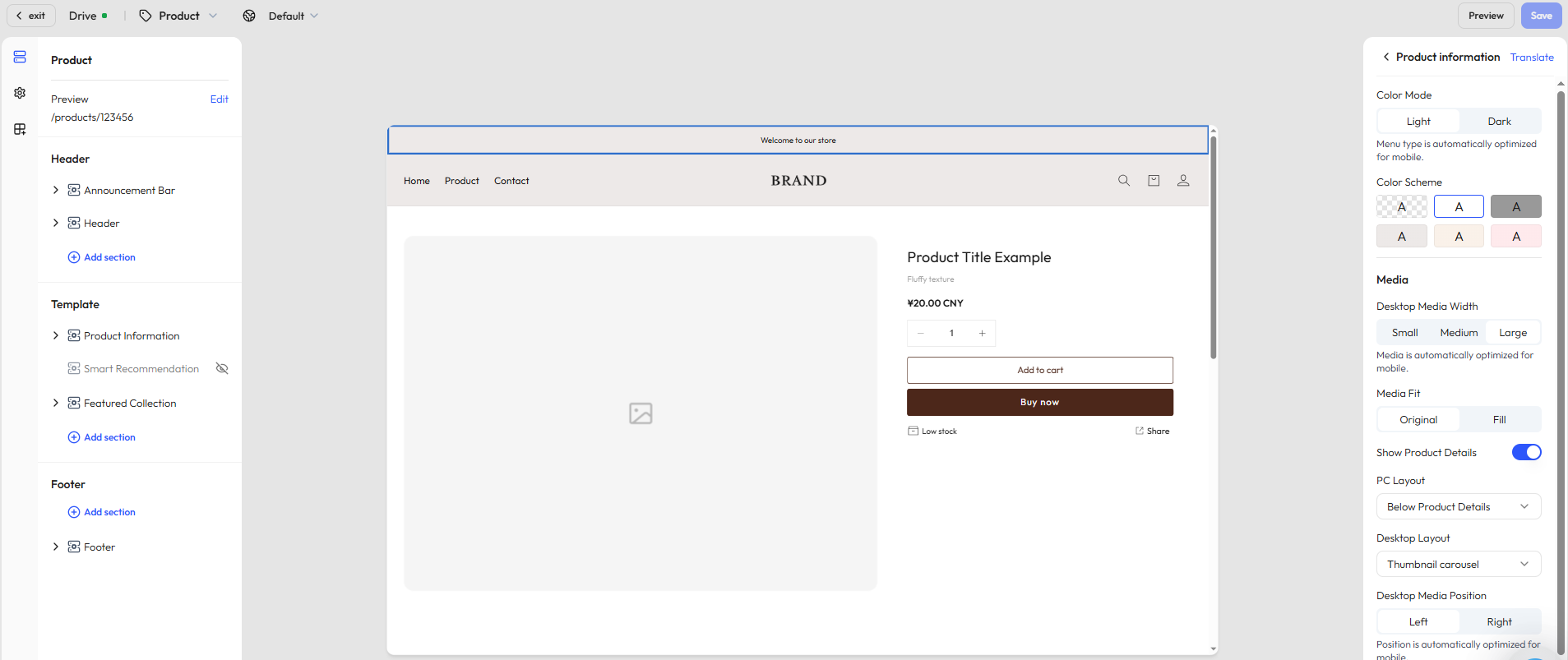
Step 3: View and edit the page structure
In the left-hand panel, you’ll find the structural layout of the page. By default, it includes the following:
- Header: Includes the announcement bar, top navigation menu, etc.
- Footer: The bottom area, typically showing newsletter signup, copyright, and policy links.
- Template: This section contains the core content of the product page and may include the following modules, depending on the chosen layout:
- Product information: Includes the product title, vendor/shipping info, price, tags, inventory, and a Buy Button. You can freely combine content blocks to create a personalized layout.
- Smart recommendations: Automatically recommends related products based on user behavior and product attributes.
- Featured collections: Showcases curated sets of related products.
Price settings
In the Price block, you can configure global settings in the theme editor:
- Show compare-at price: Choose whether to display the original price for comparison.
- Price text size: Select from small / medium / large / extra-large to fit different visual needs.
- Price style enhancement: Enable bold text to highlight the sale price and improve conversions.
- Show taxes: Choose whether to display tax information.
- Product badges: Enable or disable badges, with customizable styles for marketing. Note: adge display has already been enabled in the style design panel.
- Discount labels: Choose between Sale or Save styles, with options to display by discount percentage or discount amount.
Badge display
In addition to price settings, you can also configure badges in the style design panel. Click the third icon on the left sidebar to open the Style design page, then locate the Badge section:
- Toggle control: Enable or disable badge display.
- Badge position: Place badges at the top left, top right, bottom left, or bottom right for flexible design.
- Badge styles: Choose from multiple style options (e.g., Style 1, Style 2) to fit different visual needs.
- Discount label types: Select Sale or Save labels.
- Discount label display: Choose whether to show the discount percentage or the discount amount.
- Badge color schemes: Apply theme color, main color, accent, or auxiliary colors to match your brand identity.
Step 4: Add content sections and apps
Beyond the default layout, you can enrich the product detail page by adding custom sections such as visuals, text, or branded media.
Add a section
Under the Template area, click Add section to choose from the following modules:
| Section type | Description |
|---|---|
| Image banner | Highlight promotional visuals or brand identity |
| Video | Embed brand stories or product overviews |
| Contact form | Let customers submit inquiries or feedback |
| Rich text | Add branded messaging or product-related content |
| Email signup | Collect emails for newsletters and offers |
| Featured products | Recommend other key products |
| Divider | Visually separate modules |
| Multicolumn layout | Create horizontal layouts with custom text and images |
| Blog posts | Embed content marketing articles |
| Image with text | Combine image and CTA text in one block |
TIP
To meet diverse design needs, Genstore regularly updates the available sections and blocks based on user feedback.
As a result, the modules shown in your editor may vary slightly from this documentation.
Additionally, section styles and features may differ depending on your selected theme
Add apps
When you click Add block or Add section, you’ll see an Apps tab in the popup window. From there, you can insert functional app modules to enhance product discovery and conversion. Available options include:
- Related products
- Bestsellers
- You may also like
- Trending now
Step 5: Customize block content and styles
Once the page structure is set, you can configure each content block to better reflect your brand and meet customer needs. Click any block to open the right-hand settings panel where you can:
- Customize text content, layout style, and order
- Adjust brand colors, visibility conditions, and image display options
You can also click Add block within each section to further enrich the content. Example blocks include:
- Divider: For clearer visual separation
- Collapsible row: Ideal for FAQs, product warnings, or return policies
- Vendor info: Reinforce product credibility with supplier details